The challenge
One app for every resort, used in the hardest conditions
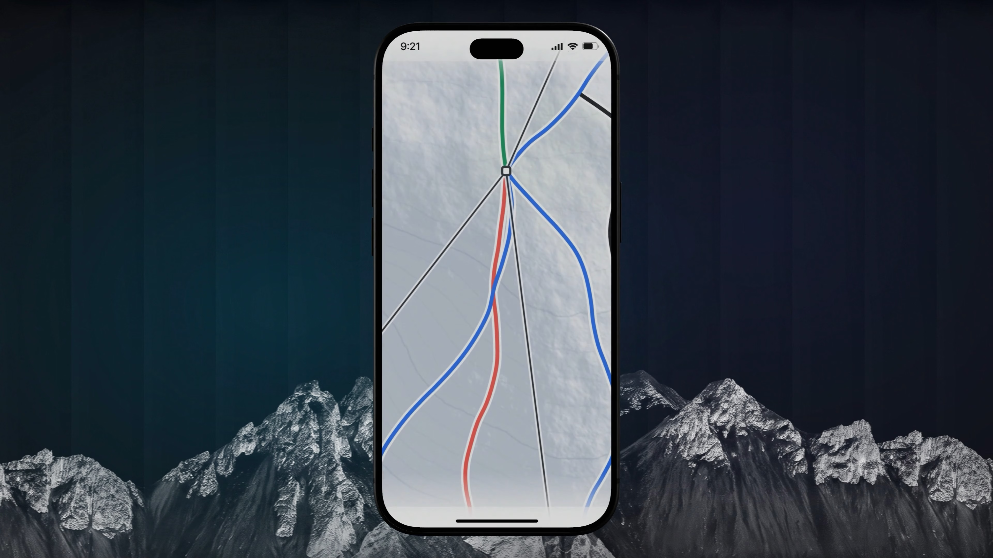
Piste Mapper helps skiers find their way around a resort: every run and lift, routes matched to their level, their group on one map. The product had to work for a person standing on a slope in gloves, and adapt to the identity of every resort it launches in. Later, tour operators joined as a distribution channel, and the app grew into a travel app that holds the whole trip.
Paper maps and generic map apps don’t answer the one question that matters on the mountain: which run and which lift get me where I need to be. People stop, guess and end up on the wrong run, sometimes above their level. It’s confusing, and it’s unsafe.
For a resort this isn’t a pain point, it’s a level of service. Guests who know where they are ski more, wait less and leave with a better impression. The app has to look like the resort’s own service, not a third-party tool.
The operator’s service usually ends at the hotel door. On the mountain the guest is left with scattered emails, printouts and other apps. A trip that feels fragmented is a reason not to book with the same operator again.
Design rules
Four rules that shaped every screen
Before designing the flows, we agreed with the client how the app must behave on the mountain. Every later decision was checked against these rules.
A skier checks the phone between runs or in a lift queue. The route, the group and resort info have to be one look away.
Large tap targets and generous spacing, sized for gloves rather than fingertips.
No hovers, nested menus or drop-down search bars. Every key action is one tap away.
The interface is designed in black, white and greys. Resort colours go on top, so the structure never depends on them.
Navigation
Every key action on the first level
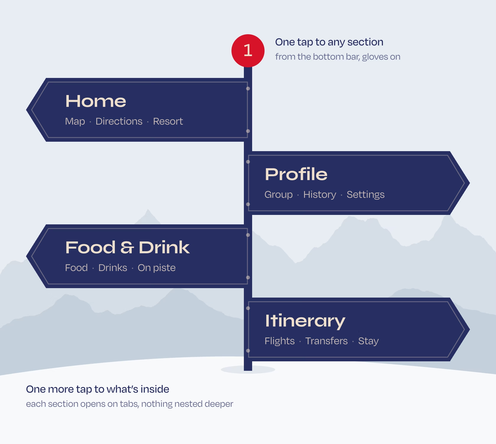
We kept the structure flat. Section tabs sit at the top, the main navigation at the bottom: Home, Profile, Food & Drink and Itinerary. Group management, history and settings live inside Profile, so the bottom bar holds only what people open on the slope.
Every key action takes one tap, with gloves on. On a slope that means fewer stops, fewer wrong turns at a junction and less time standing in the cold.

White-label
One product, any resort’s identity
Each resort launches the app in its own colours. For white-label app design, the question was how to let the brand in without letting it change how the interface reads.
Every resort brings a primary and a secondary colour. Some pairs sit close together, some clash, like red with blue.
We designed the interface in monochrome first: black, white and greys hold the structure and hierarchy. Brand colours go only on accents.
Any palette, even a complementary one, gives a coherent interface. A new resort means new colour values in one design system, not new screens.
The product scales resort by resort without design work, and every resort gets an app that looks like its own and reads the same way for the skier.

Core flows
One flow for each question on the mountain
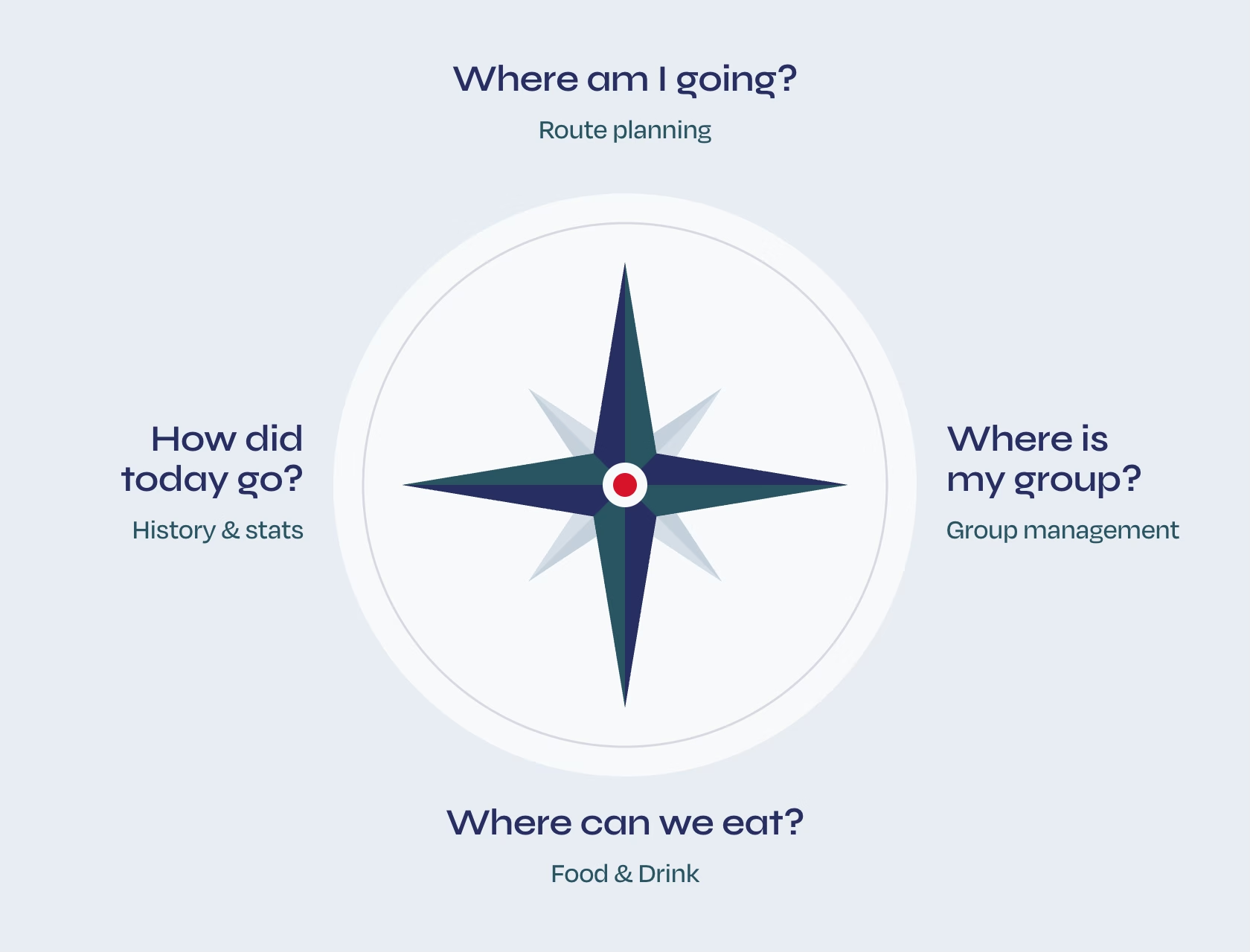
Where am I going, where is my group, where can we eat, how did today go. Each flow answers one of these questions, with states and edge cases designed for each. Three of them run on the map, so the map UI had to stay readable at a glance.
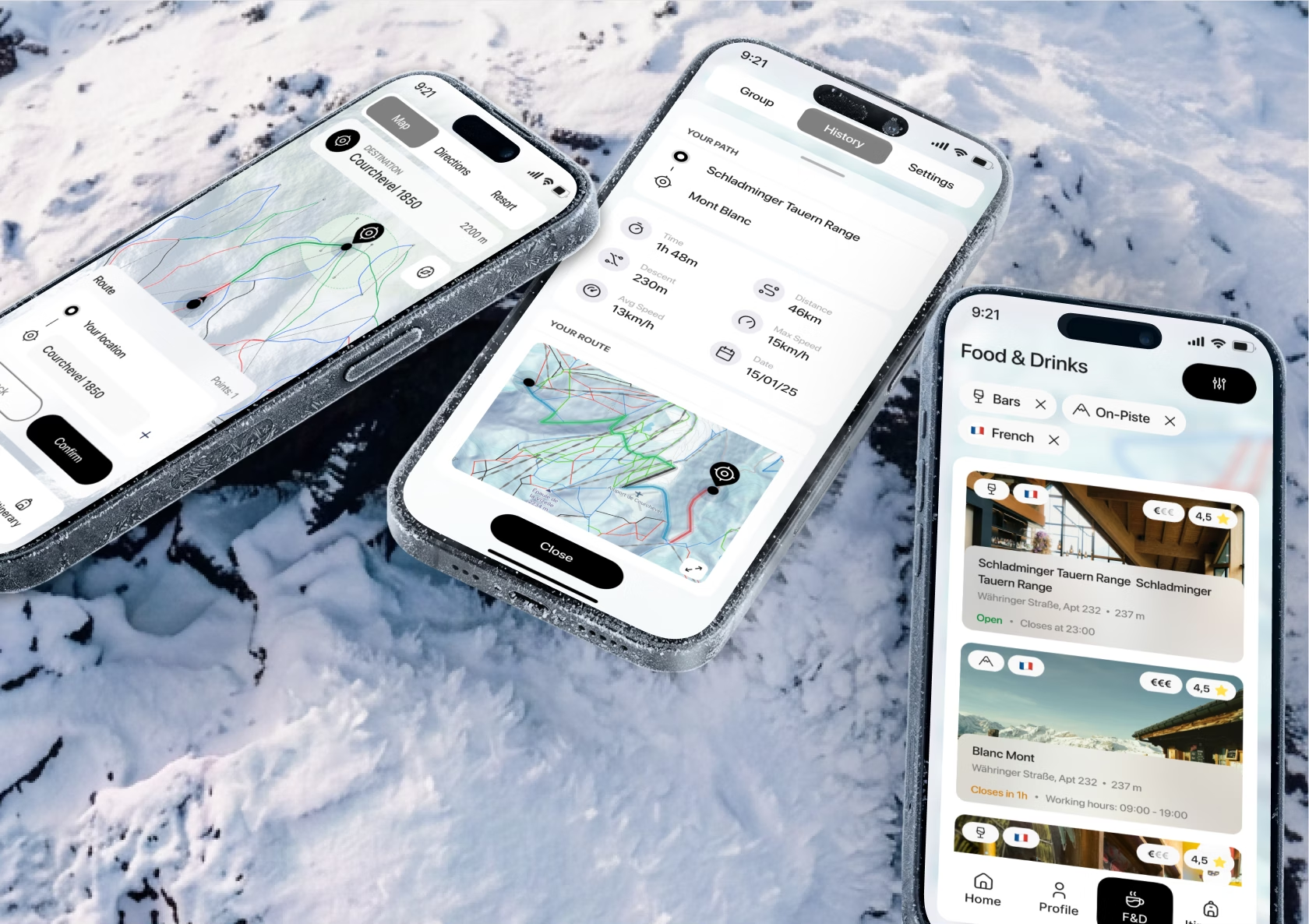
Routes are generated from runs and lifts and stay within the grades the skier has chosen in settings.
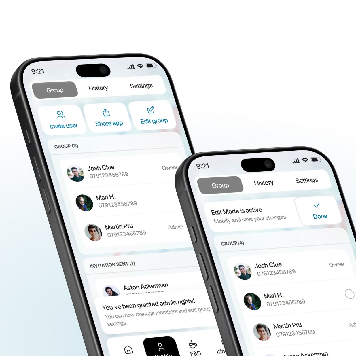
The group is created and managed in the app: invite people by link, see members live on the map. The admin manages the group, members join and share their location.
A guide to the resort: which bars and restaurants there are, where to find them and whether they are open now.
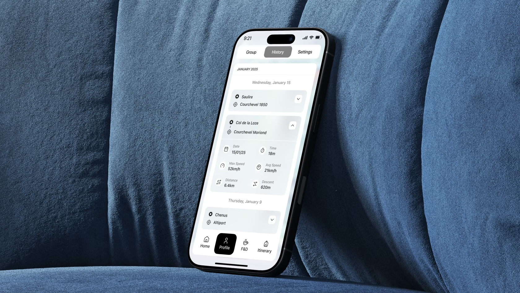
Each day on a timeline. A run opens with its path on the map, time, distance, vertical and speed.
Comfortable run grades and preferred lift types, set once and used by every route.
Itinerary
Trip data, organised by the moment it’s needed
When tour operators joined as a distribution channel, the app took on their side of the holiday: the operator covers not only the trip itself but the guest’s comfort on the mountain. The client shared the data an operator’s CRM holds. Our task was to turn it into something a guest can use on the move.
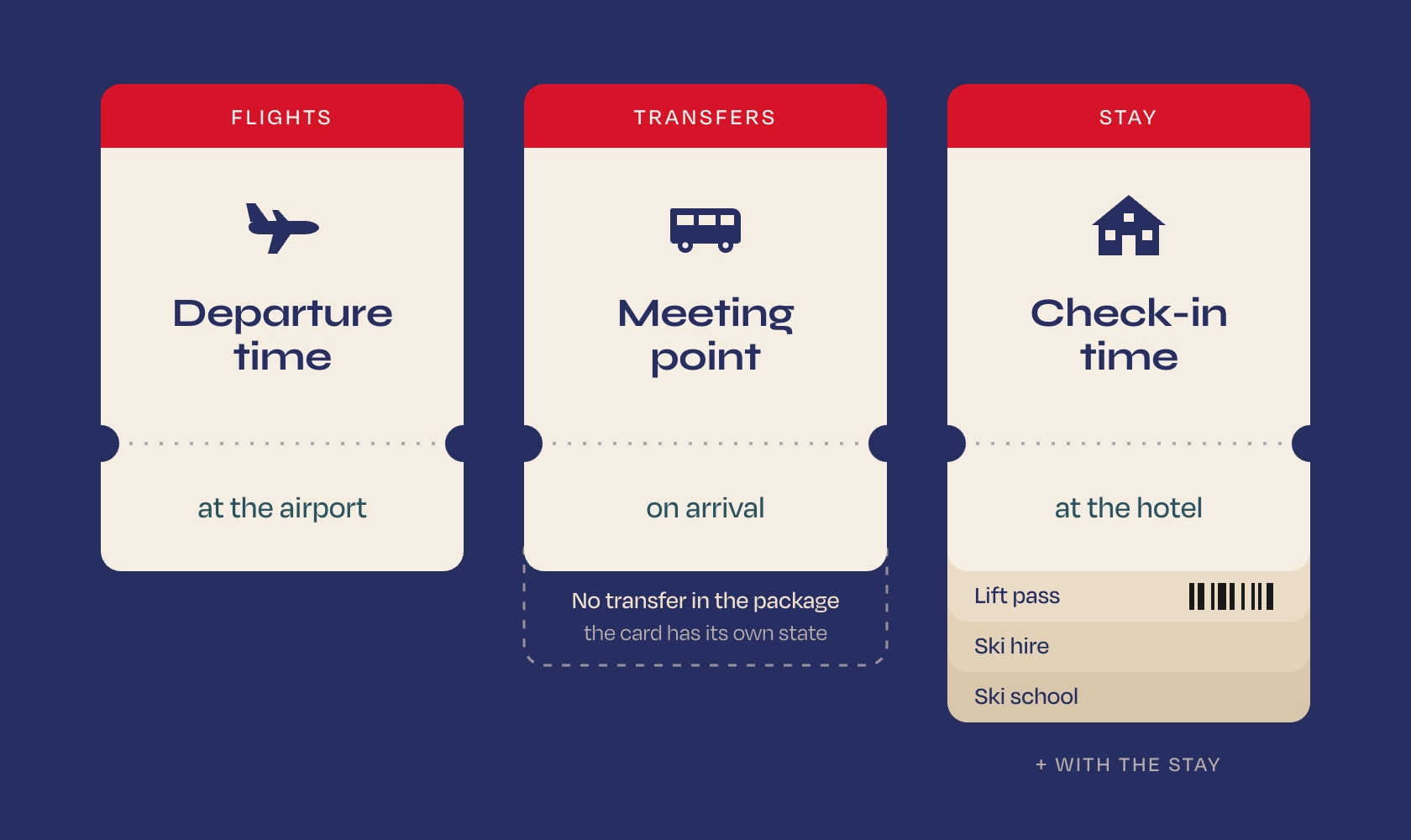
Three tabs follow the order a guest goes through: flights, transfers, stay. Lift pass, ski hire and ski school sit with the stay, where they are used.
Each card opens with what the guest looks for right then: departure time at the airport, the meeting point for a transfer, check-in time at the hotel, a barcode at the lift gate.
Packages differ: not every guest has a transfer or a hotel photo. Each card has a state for missing data, so a partial booking never looks broken.
All bookings share one card structure, so a new type of service from the CRM fits in without new design.
The operator’s service now reaches the mountain, and the guest has the whole trip in the same app as the map.
Website
Two audiences, two reasons to care
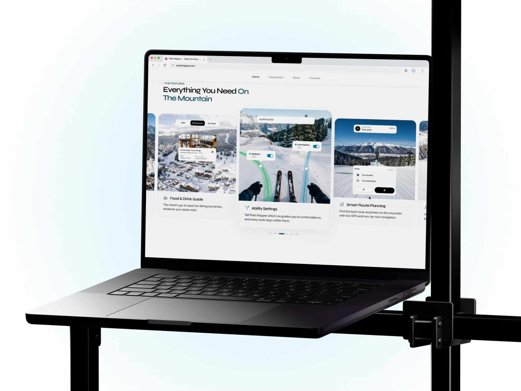
Like any app landing page, the website has to convince skiers to download the app. This one also had to convince tour operators to offer it to their guests. They need different arguments, so we built two separate narratives on one visual language.
We start from situations they recognise: a wrong turn, a lost group, a run above their level. Features appear as answers to them, then resorts and the download.
We start from their business: their service ends when the guest reaches the resort. The page shows how the app extends it to the mountain and how simple the launch is.
Ski photography with interface elements layered on top shows the product where it is used and explains a digital tool better than screenshots alone.
Route graphics and interface elements on the website come from the app, and the same system carries the store screenshots and the sales deck. Every touchpoint tells one story.
Results
One product that works for three sides
Piste Mapper got a product that serves the skier on the slope, the resort that launches it in its own identity and the tour operator that brings it to guests.
An app built for gloves and cold, where every key action takes one tap.
A white-label system: each new resort is a set of colour values, not a redesign.
An itinerary built from their CRM data that extends their service from the trip to the time on the mountain.
Tell us about your product and the brands it has to carry. We will plan one design system that stays clear in every colour.