Research & UX audit
Competitors leave patients guessing. We started there.
We audited the existing app and mapped four priority flows: log-in and sign-up, on-demand doctor request, medical history form, and scheduled doctor visit. These are the flows patients use most, and they shape the overall experience. As the product grew, the audit covered more flows built on the same patterns.
We also compared competitors across seven criteria, including service model, personalisation, user feedback, and Nielsen's heuristics. Three heuristics turned out to be critical for this product:
Competitors rarely show where a request or visit stands.
Weak forms and unclear confirmations lead to wrong choices.
There is little guidance on what to do when something goes wrong.
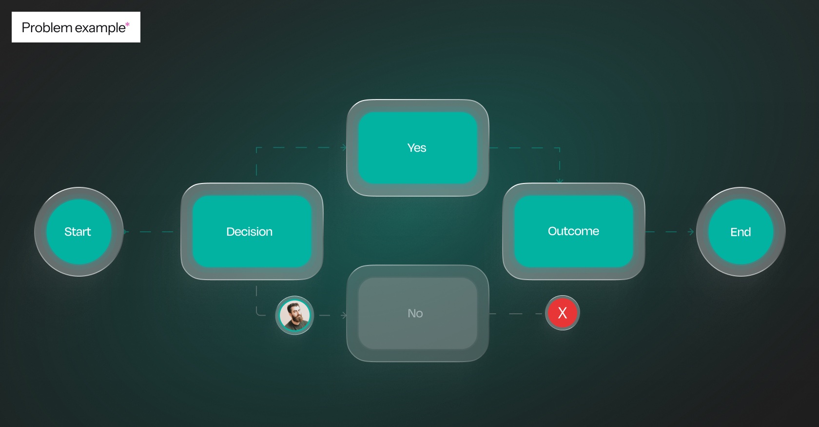
Established a research-informed foundation for prioritising improvements and designing clearer, more predictable healthcare interactions.
Design system & consistency
One product — one set of rules
We unified typography, colours, spacing, components, icons, and visual hierarchy. Desktop patterns were replaced with familiar mobile conventions. We also defined states for components, errors, loading, and success screens.

Reduced interface inconsistency and made interactions more predictable, while creating reusable design patterns for existing and future features.
Real screens, the full audit and the design system, walked through live by the team that built them.

Navigation & home
Key actions were hidden. We moved them to the first screen.
The hamburger menu was replaced by a bottom bar with five sections. On deeper screens the bar is hidden and replaced with a back control, so the user stays focused on the task.
We also designed a Home dashboard featuring quick actions, family profiles, upcoming appointments, notifications, and relevant services. For regions where some services are not yet available, we designed a separate state.
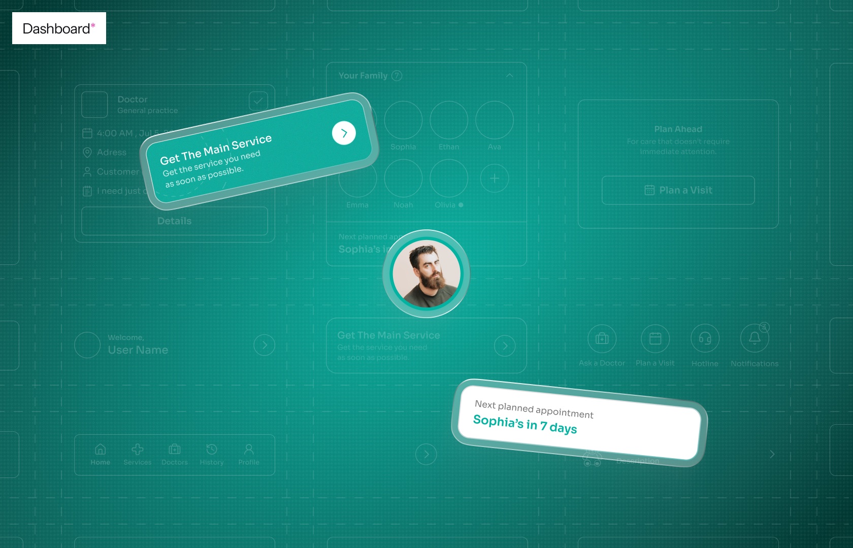
Made essential information and actions easier to find, reducing unnecessary navigation and creating a clearer starting point for patients.
Core flows
Improving core healthcare journeys
We redesigned the application's most important user flows, addressing interaction logic rather than simply updating individual screens.
Refined authentication and registration flows, improved information hierarchy, and introduced a compact, reusable progress indicator.
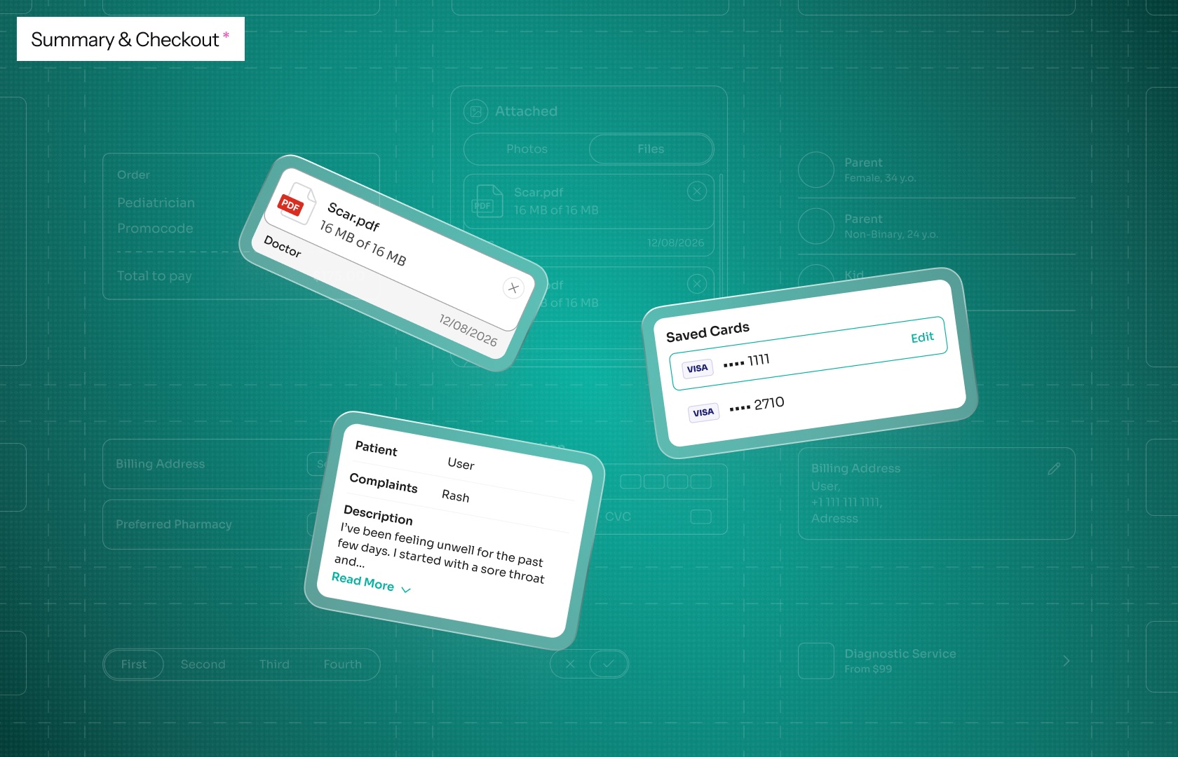
Reworked the care-request journey, from service selection to booking, payment, and confirmation, and designed Stripe payment interfaces within its customisation constraints.
Standardised form layouts, response controls, and screen structure. Improved readability, reduced information overload, and clarified progress throughout the form.
Extended booking patterns to planned visits, refining doctor discovery through map and list views, status visibility, and location search, saving, and selection.
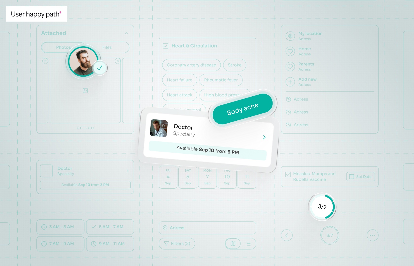
A consistent, predictable experience across the entire patient journey, from sign-up to booking. Clearer information hierarchy, visible progress, and better feedback reduce uncertainty and cognitive effort, making key flows more intuitive, especially in time-sensitive medical situations.
Additional functionality
Expanding the patient experience
As the product grew, we extended the same patterns to new and supporting features:
Diagnostics, with categories, subservices, and benefits; chat or call with a doctor, built on the existing booking flow; an improved History with clearer hierarchy and statuses, where chat moved to its own screen; and a more polished, consistent Profile.
Enabled the product to grow while maintaining familiar interactions, making new functionality easier to navigate and understand.
Custom graphics
Developing a distinct visual language
We prepared five illustration concepts and chose a linear hand-drawn style together with the client. Slightly uneven lines recall a doctor's sketch, and the images stay easy to read. We created graphics for services, subservices, and empty states.

Created a recognisable visual language that supports content comprehension and makes the interface feel more approachable.
Outcome
From separate screens to a working product
The redesign established a more consistent foundation for the patient application and supported its expanding range of healthcare services.