Nova UA FCU

Website redesign and Webflow build for a heritage credit union

2025 – Ongoing
Website redesign
Credit union
Challenge

A modern website that meets today’s digital expectations without alienating long-time members or losing the credit union’s cultural identity.

Approach

Design and Webflow development in parallel from week one: UX research and strategy, a scalable layout system, SEO and performance.

Result

A future-proof digital foundation: easier onboarding, a better member experience and measurable growth in online engagement, with an identity that honours its roots.

+35%
Audience growth
5×
Faster publishing
85%
Mobile-first adoption
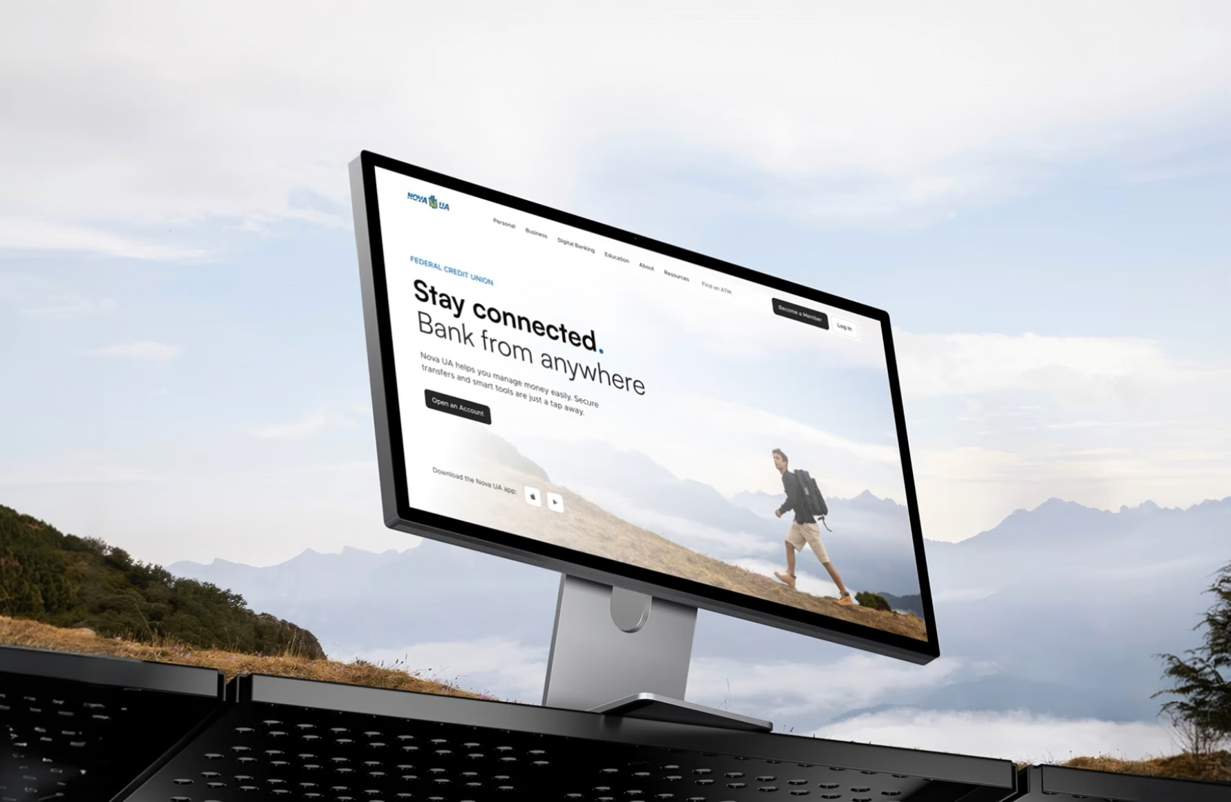
Nova UA FCU website on a desktop display against a mountain landscape
Services
Timeline

8 sprints

Industry

Credit union

Stack

Figma, FigJam, Webflow

Challenge

Modernise a heritage brand without flattening its warmth

After more than a decade on the same website, Nova UA needed a full digital reset — without alienating long-time members or losing its cultural identity. Strong offline, nearly invisible online.

Input

A heritage brand with deep roots and a legacy storefront never built for mobile.

Reasoning

Run design and Webflow in parallel, and modernise through typography and tone rather than a new identity.

Outcome

A modular site system, restructured key flows and a story architecture that is easy to scan.

Nova UA mobile site on a phone against the sky
Nova UA homepage on a laptop

Research & strategy

Benchmarked against the banks members compare us to

We measured where a heritage credit union can outperform large banks, and where the gap was widening. Each row is a member-defined attribute, not a feature checklist.

Criterion
Nova UA
Competitor
Member-first navigation
Yes
No
Community focus
Yes
No
WCAG 2.2 AA across the site
Yes
No
$0 monthly fees
Yes
No
Clicks to open an account
4 clicks
12 clicks
Bilingual support
Yes
No
Local cultural engagement
Yes
No
3-click rule

Every key action is reachable within three clicks from any page.

Mobile-first

The phone is the primary experience, not a fallback layout.

Life-stage pages

Content follows members’ real moments, not abstract product categories.
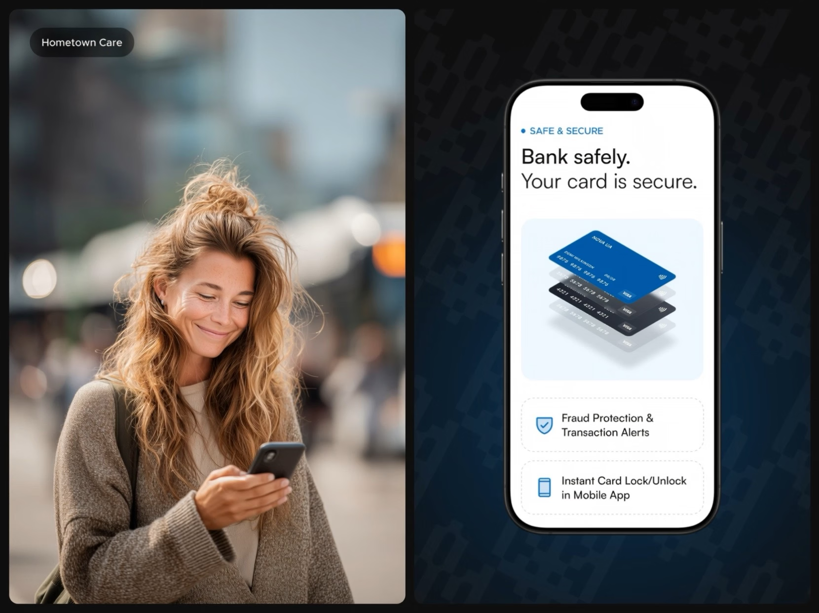
A smiling woman holding a phone, next to the Nova UA “Bank safely” card security screen
Nova UA history page on an iMac

UI system & Webflow

17 templates and one layout grammar the team extends on its own

Design and Webflow development ran in parallel from week one. Fewer handoffs, faster learning, and build decisions made with production in mind. Eight sprints, one system.

Scalable Webflow setup: page templates and CMS structure
Nova UA website on tablets, made in Webflow
“Learn and grow” knowledge hub on a tablet“Empowering teens” page layouts

SEO & performance

Built to be found, and to load fast on the phones members use

We rebuilt content as crawlable HTML, optimised every asset and put structure where there had only been visuals. Every component was redesigned mobile-first.

Nova UA mobile screens
Mission and values screen on a phone

Results

A foundation the marketing team ships on without us

Easier onboarding, a clearer member experience and a modern identity that keeps the credit union’s roots — ready for the next generation of members.

Hands holding a phone with Nova UA online banking
Free 30 min call
Planning a similar project?

Talk it through with the team that built Nova UA: the research, a Webflow system your team runs on its own, and what moved the numbers.


Sviat Luchyn, Co-founder and CEO of Flying Age
Sviat Luchyn
Co-founder & CEO
sviat@flying-age.com
Val Bogattchouk, CEO of Nova UA FCU
Val Bogattchouk, CEO
"What stood out most was their ability to combine strategic thinking with clean, user-focused design."
The project was managed in an organized and transparent way, with regular updates and clear timelines. The team was responsive and open to feedback, quickly addressing our requests and keeping the process smooth from start to finish.