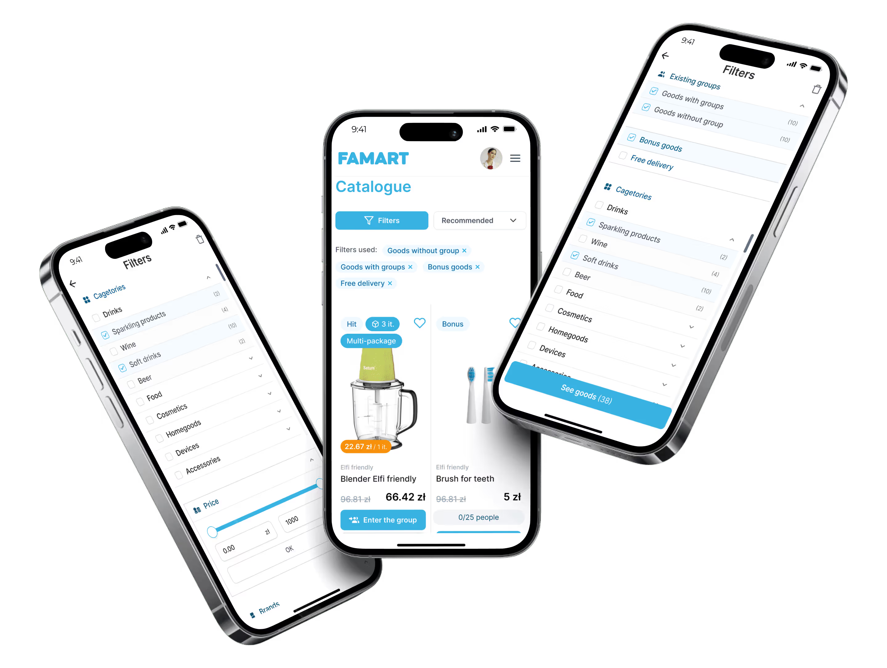

UX research & improvements
Heatmaps showed where users gave up
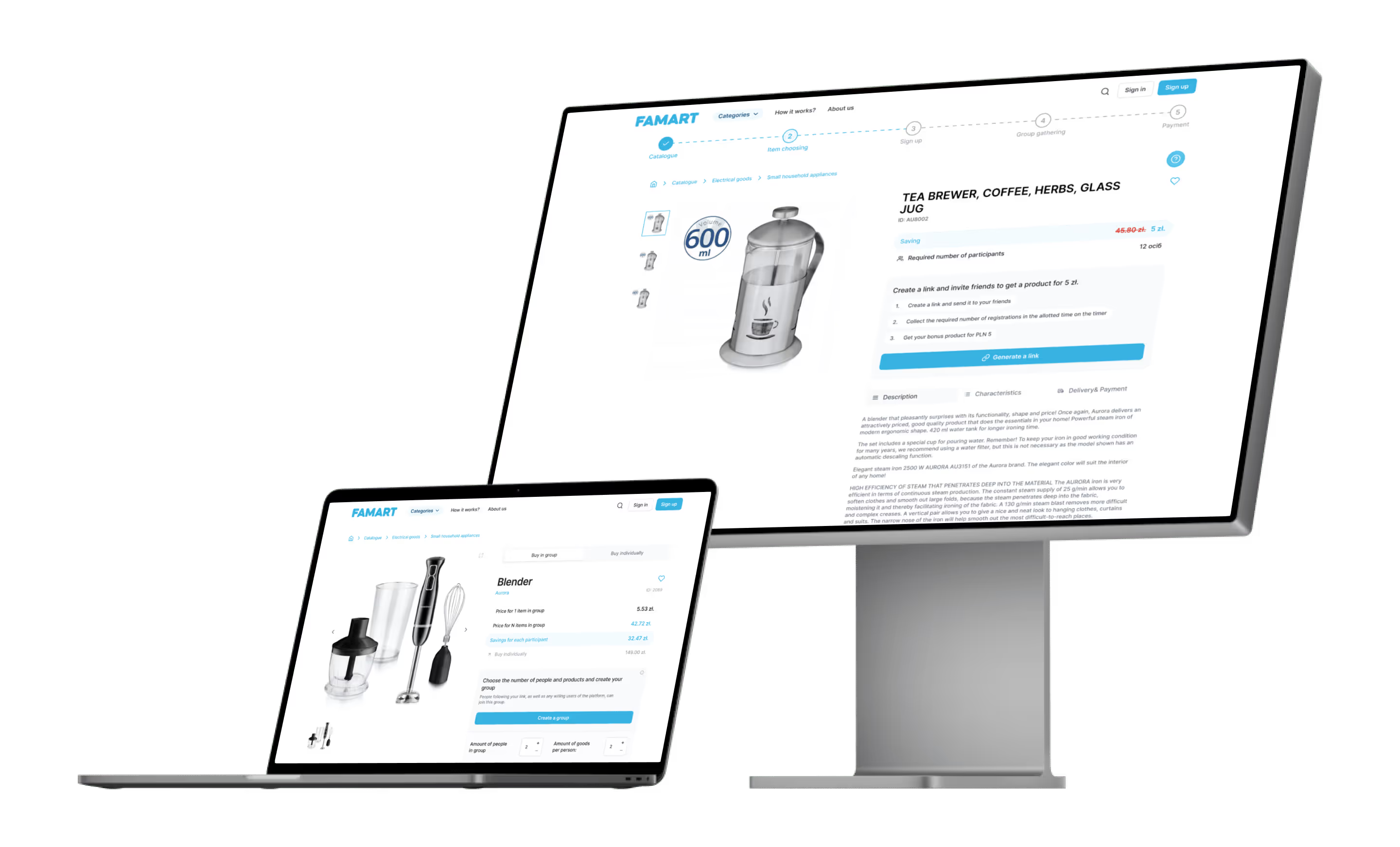
Many visitors left without interacting. We built new user flows, improved filters, switched buttons from red to blue for consistency and unified bonus and regular product pages.
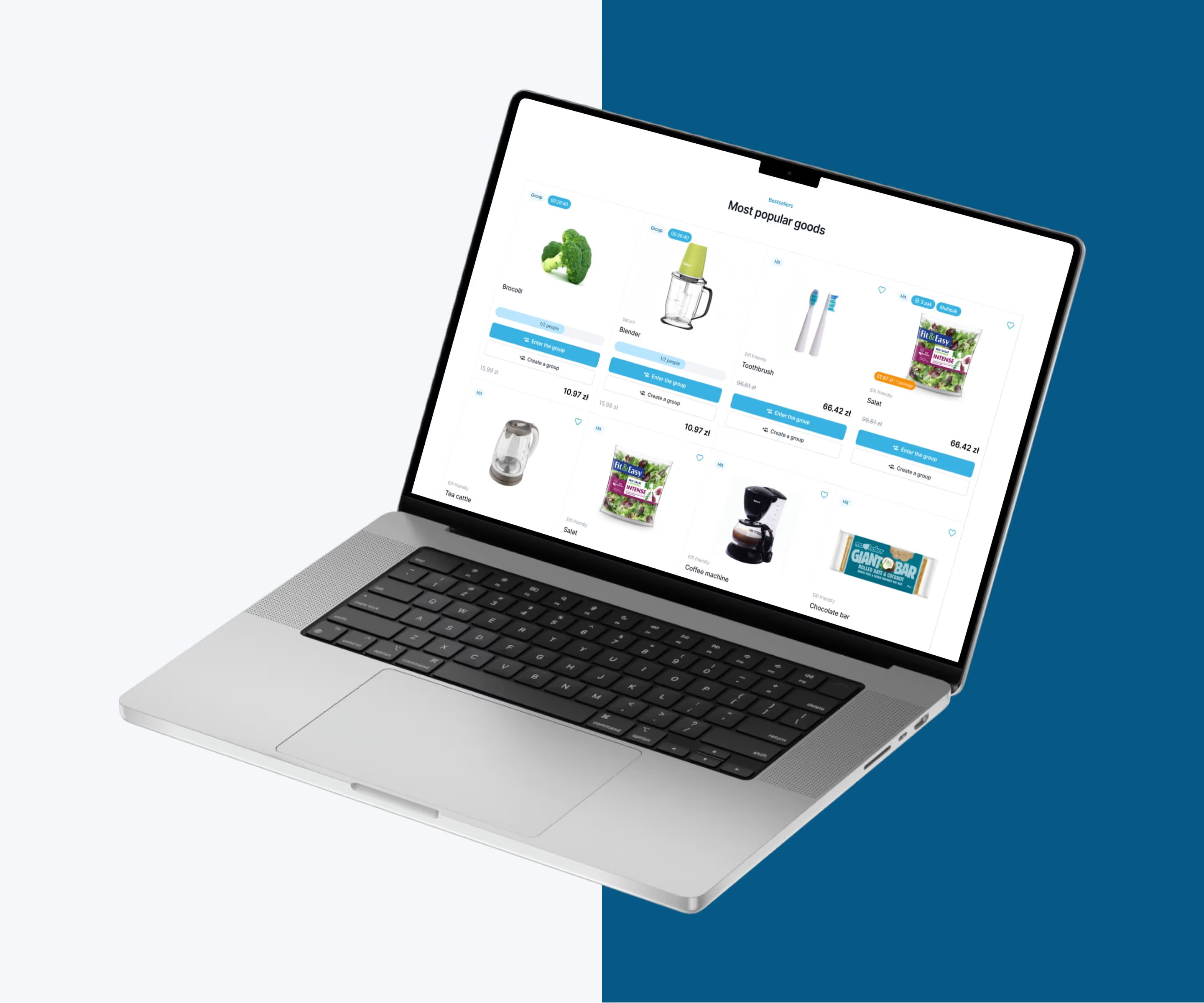
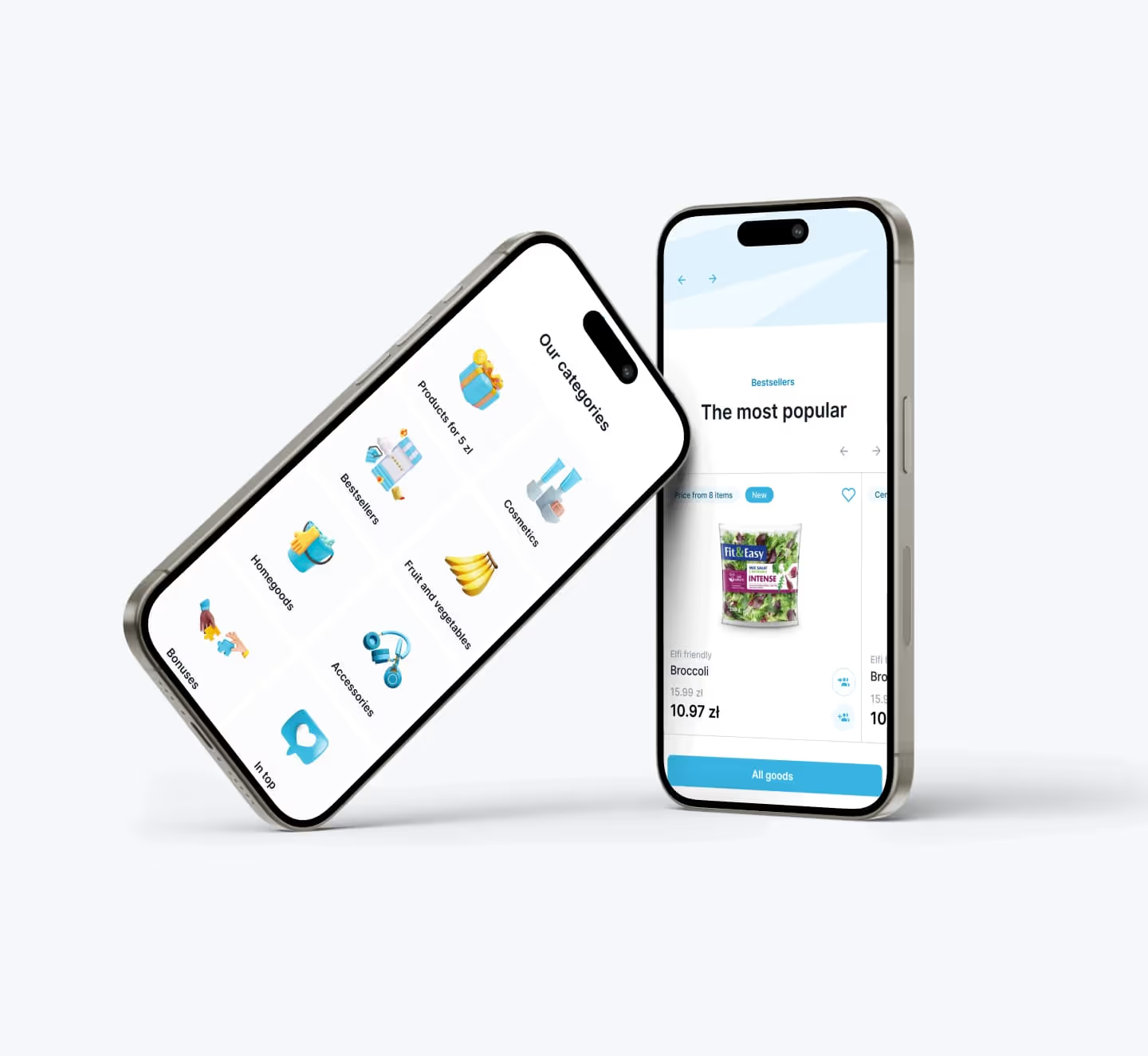
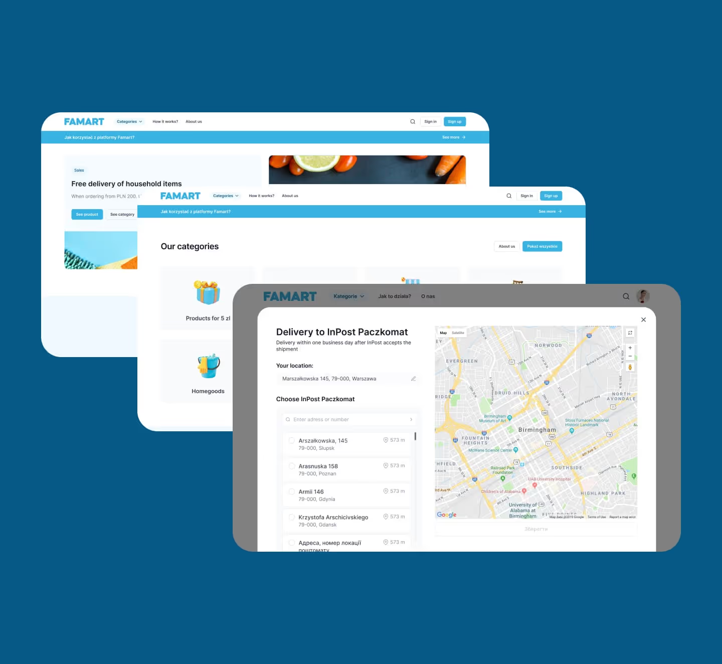
UI improvements
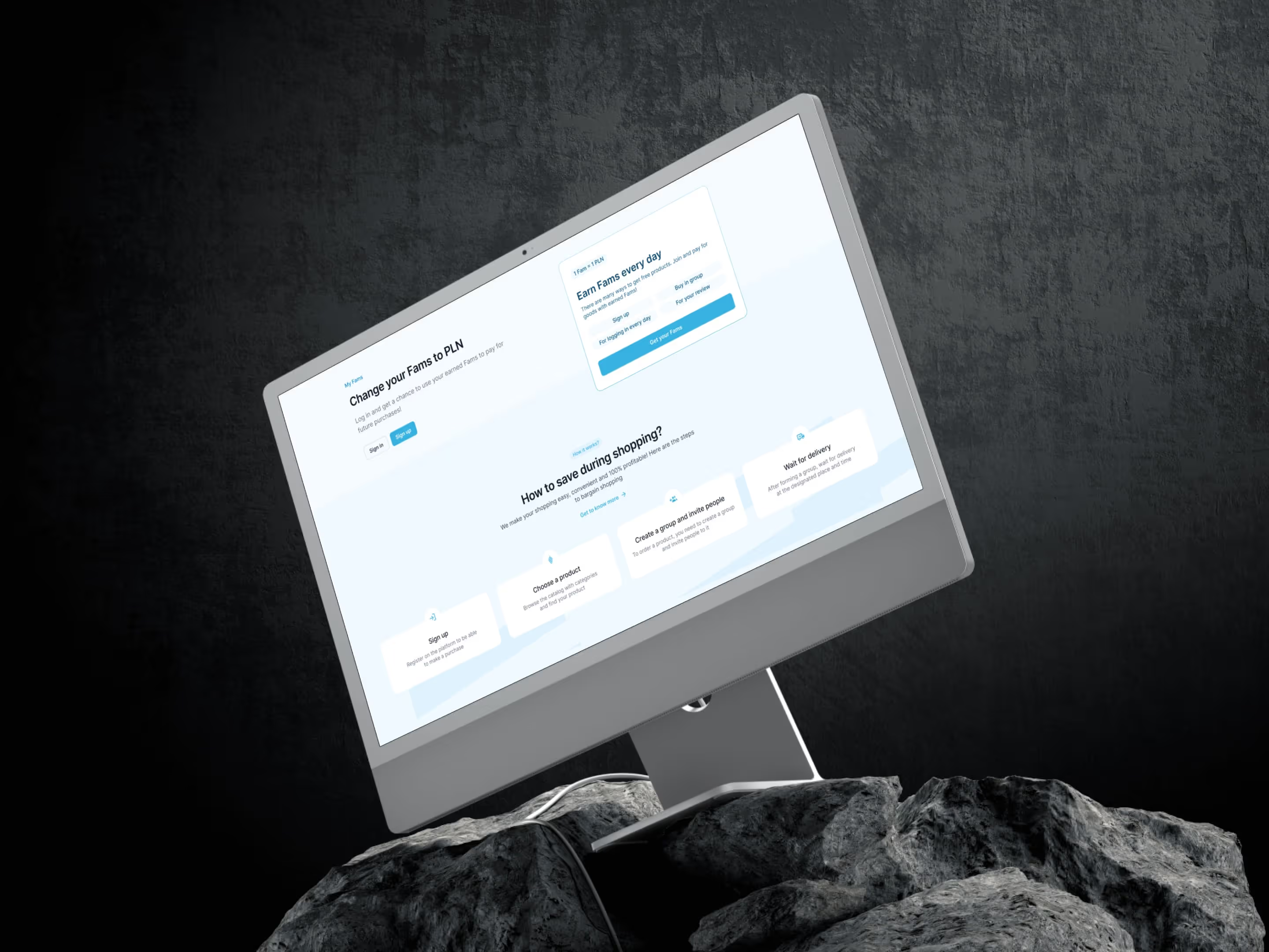
A "How it works?" page users get at a glance
We redesigned the page for visual clarity and refined colours, typography and composition across the platform.
Prompts & progress bar
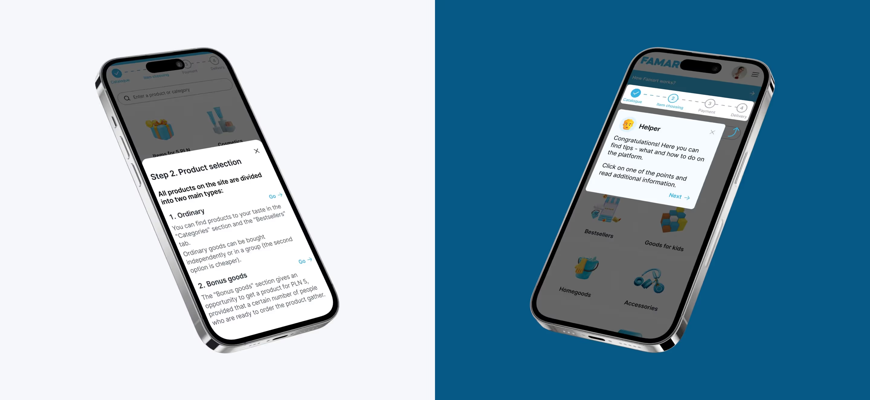
Guidance at every step, from catalogue to delivery
Prompts and a progress bar guide users where they used to struggle, from browsing and choosing items to sign-up, payment and delivery.
Free 30 min call
Planning a similar project?
Talk it through with the team that redesigned Famart: research-led fixes that help users finish what they start.